
Rarely do you hear the terms “Horizon” and “Power BI” within the same sentence. Because Horizon basically pumps everything into the Events database, you can get some pretty cool statistics that can be visualized with Power BI. This includes user logins, reconnects, and even admin events like desktop restarts. I’m going to talk about these three basic visualizations in this post, but I am hoping to get into more advanced stuff later on.
*** Note before we get started*** One thing I have learned about Power BI: when it comes to filtering, filter at the SQL query level (using “WHERE”) on your dataset once you start getting into the millions of rows. Power BI filtering is great and extremely easy to use, but it is very time consuming. If you have a robust SQL instance and a fairly simple WHERE statement, it can filter through millions of rows in seconds. I’ve found that Power BI typically takes one minute per million rows to filter, meaning when you actually try to pull up the report, the data can take a long time to become viewable. Because I don’t have many events in my lab, you won’t see me doing this, but do yourself a favor and start off filtering via the SQL query as much as possible!
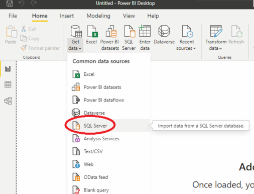
First thing’s first – download and install Power BI for Desktop to get started. The first step is to add our SQL database as a data source, so go to Get data > SQL Server:
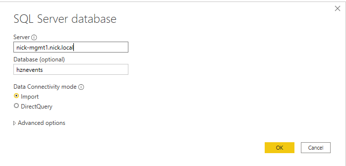
Next, type in your Horizon Events server and database name. Because we’re going to be manipulating some tables and need Power BI to do date calculations for us, we’re going to use the Import option. See here for differences in Import vs DirectQuery. The Advanced Options is where you would type your query if you need to trim down your data in very large instances, like I was referring to earlier. Otherwise your Power BI filtering will take a long time.
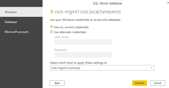
Use current credentials or specify them if you don’t have access to the database with your logged in account. If not using TLS, click OK through the encryption warning.
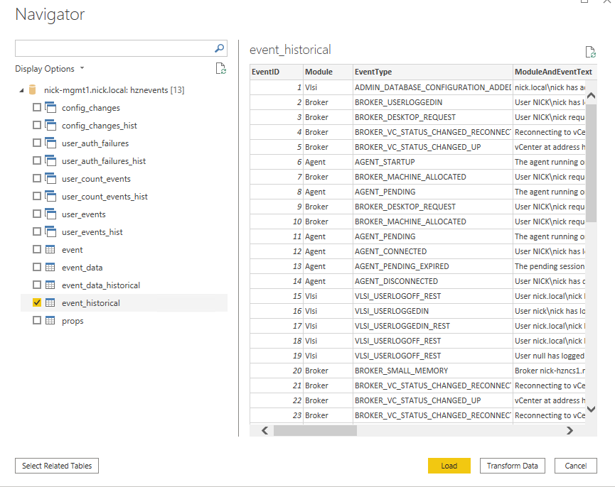
Choose the event_historical table. If using a query in the advanced options, you will not get this option. Select Load.
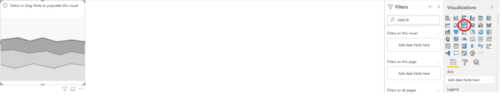
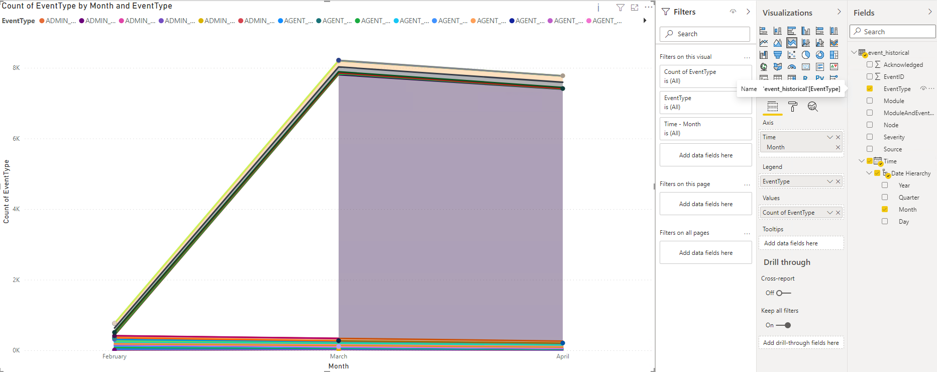
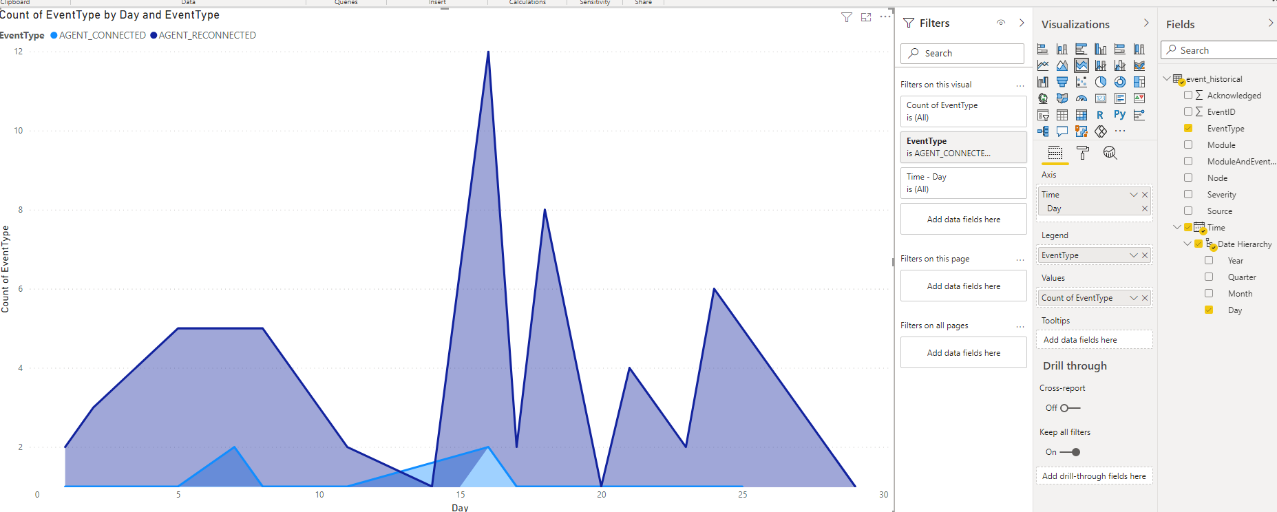
Awesome – now we have our data source imported into Power BI! Let’s try our first visualization now – desktop logins and reconnects. Let’s show this with a stacked area chart to see how many user logins versus reconnects are happening per month. First, select the “Stacked area chart” on the Visualizations pane. This will pop in a blank chart on the main page:
Now, let’s add the fields to the chart to make it useful. You can see that Power BI automatically detected the Time column and made a date hierarchy for us, so we’ll use that to automatically output the month. Drag Month to the Axis section so that it becomes our X axis. Then, drag EventType to Legends and Values. Resize your chart so you can see it a little easier, and it should look like this:
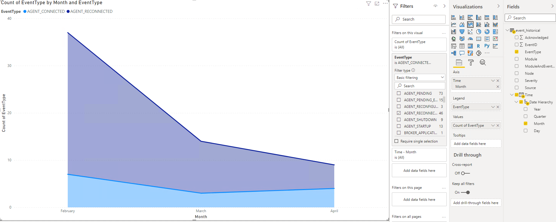
We’re on the right track, but you can see that we’re gathering ALL Horizon events, not just our logins and reconnects. No problem! On the Filters pane, let’s filter only by AGENT_CONNECTED (logins) and AGENT_RECONNECTED (reconnects). Much better!
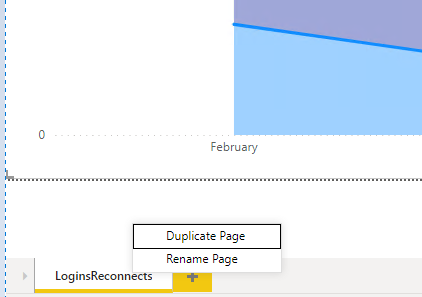
Now, what if I want to create the same visualization that just shows when admins logged users off their desktop? Simply duplicate the current tab…
Rename it appropriately, select the chart, and choose only the ADMIN_DESKTOP_SESSION_LOGOFF filter. Note that there are also other options you may want to include, including restart and resets to show all of your various troubleshooting tasks, but we’ll just use this one for now!
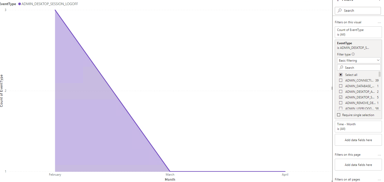
We can conclude from this chart that service desk had a few troubleshooting sessions with our VDI users in February, but we obviously made some improvements to the environment in March and April, because it has been smooth the last couple of months! You can start seeing how this can be used to track environment stability and improvements via the amount of helpdesk calls… simple but powerful!
Before we wrap it up for this post, I did want to show you how to manipulate the Time column a bit. While Power BI is great at automatically setting up our Date Hierarchy for us, it can get a little weird when doing visualizations. For example, what if I wanted to track logins/reconnects on a daily basis? Here’s what it looks like if I use Day instead of Month in my Axis…
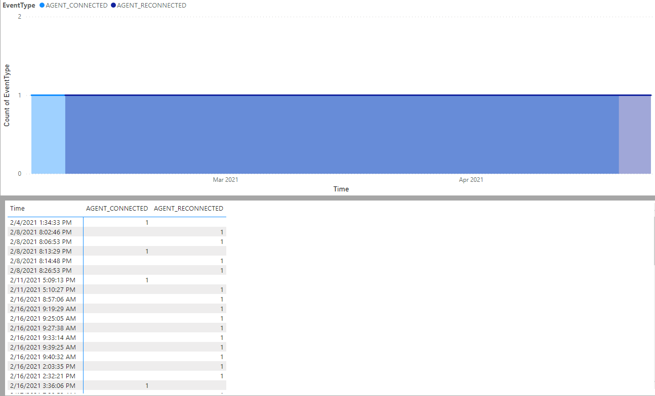
Yuck – you can see it’s just showing the Nth day of the month, and I’m pretty sure it’s just counting all of the months as well… so day #1 is showing March 1, April 1, etc. We obviously don’t want that! Ok, so I’ll just turn off the Date Hierarchy checkbox! Well, then it comes out looking like 1 event per timestamp, so a useless flat line like this. I included the table data so you can easily see what’s happening…
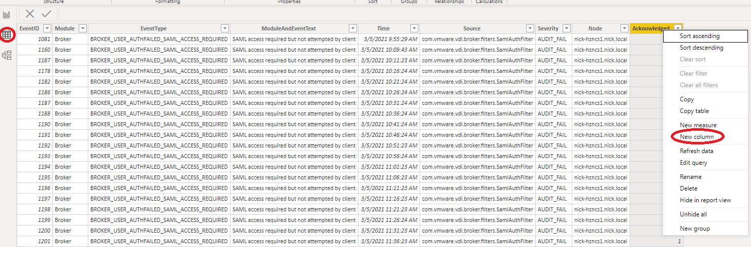
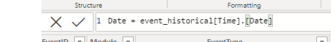
The solution here is to make a custom column that only includes the date without the time – luckily, this is quite easy to do with Power BI! First, go to the tables view on the left, and create a new column:
We’ll call this column Date. We’ll populate it based on the Date property from the Time column of the event_historical table. Here’s what the formula looks like:
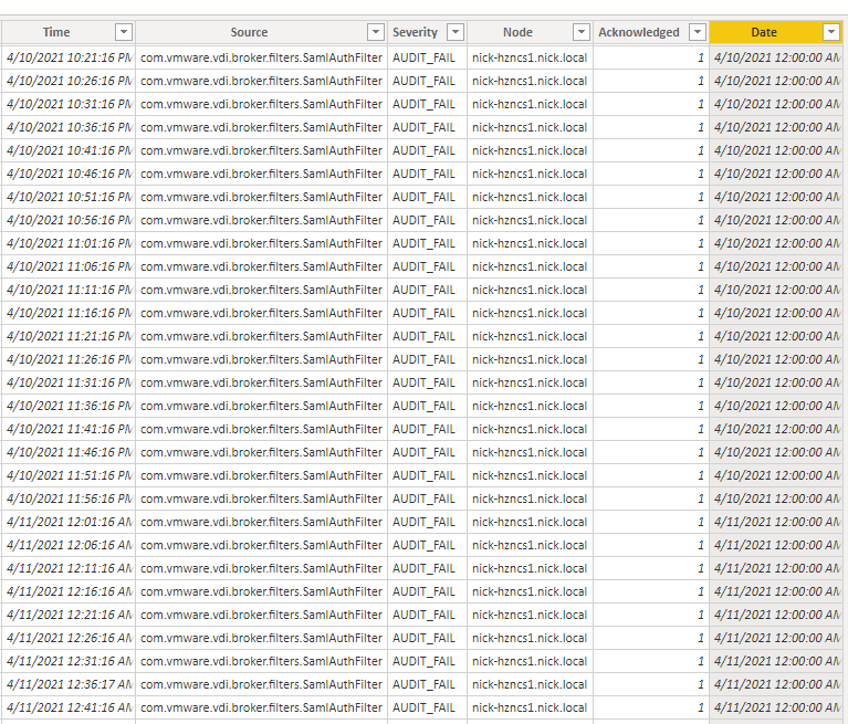
Nice – so now we have a column that just puts a generic 00:00:00 timestamp on it with the date! Now we can use it back in our visual:
Back on the Report section, we can see that our new Date column is now available. Let’s remove our Time field and replace it with the date field. Let’s also disable the automatic Date Hierarchy so it displays how we want it in the visual:
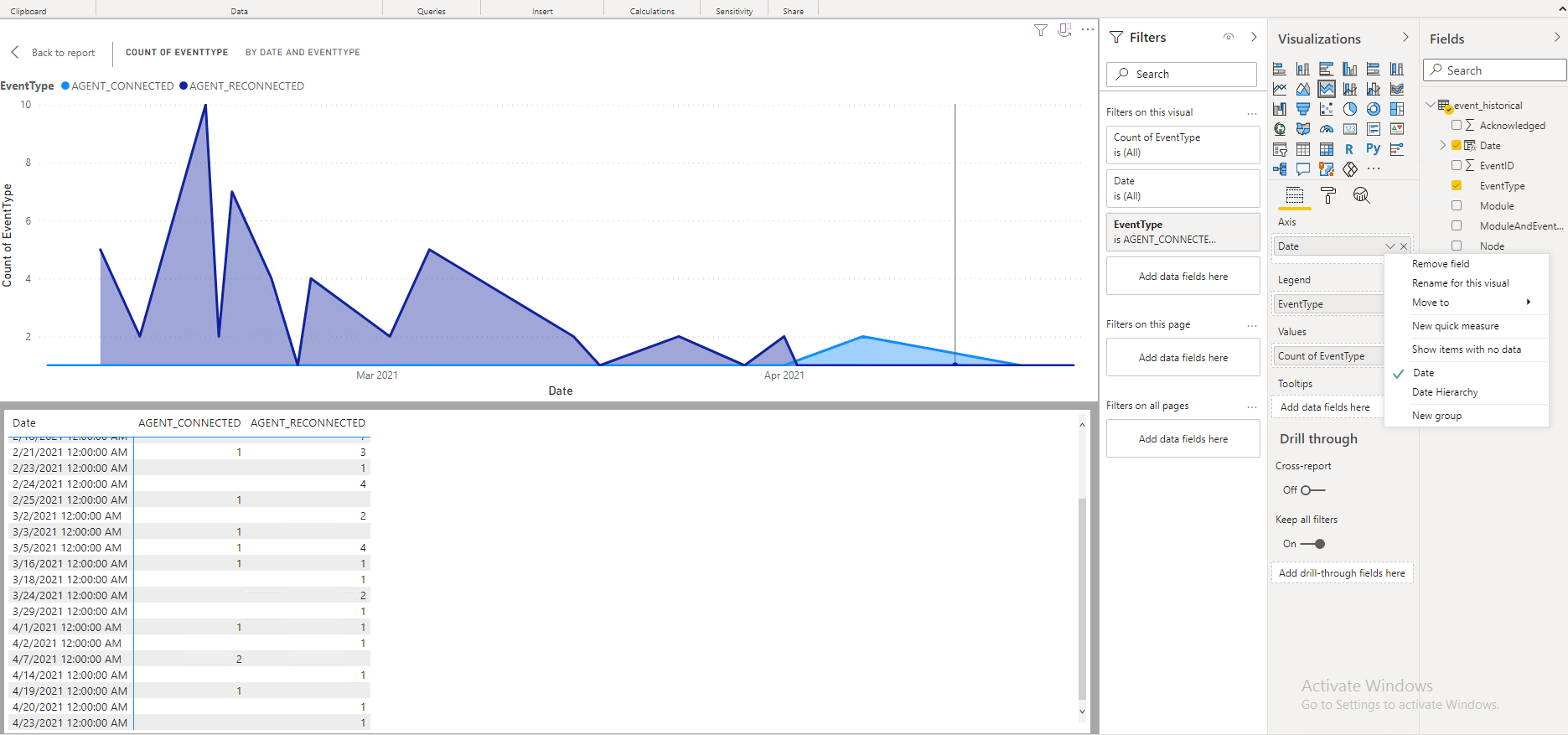
Excellent! Again, I put the table data below the chart so you can easily see that it’s displaying the data as desired!
As you can see, visualizing your Horizon Events with Power BI is a simple yet powerful tool to get an idea on what’s going on in your environment. You can also publish it to 365 and hook it up with a Power BI Gateway to have a real-time, up-to-date dashboard. I am going to make this a multi-part series, as there are a ton of useful metrics you can get out of the Horizon Events database alone, not to mention App Volumes, REST API, etc. If there is anything you want me to specifically cover, please email me or reach out on LinkedIn! Enjoy!